E-commerce website redesign
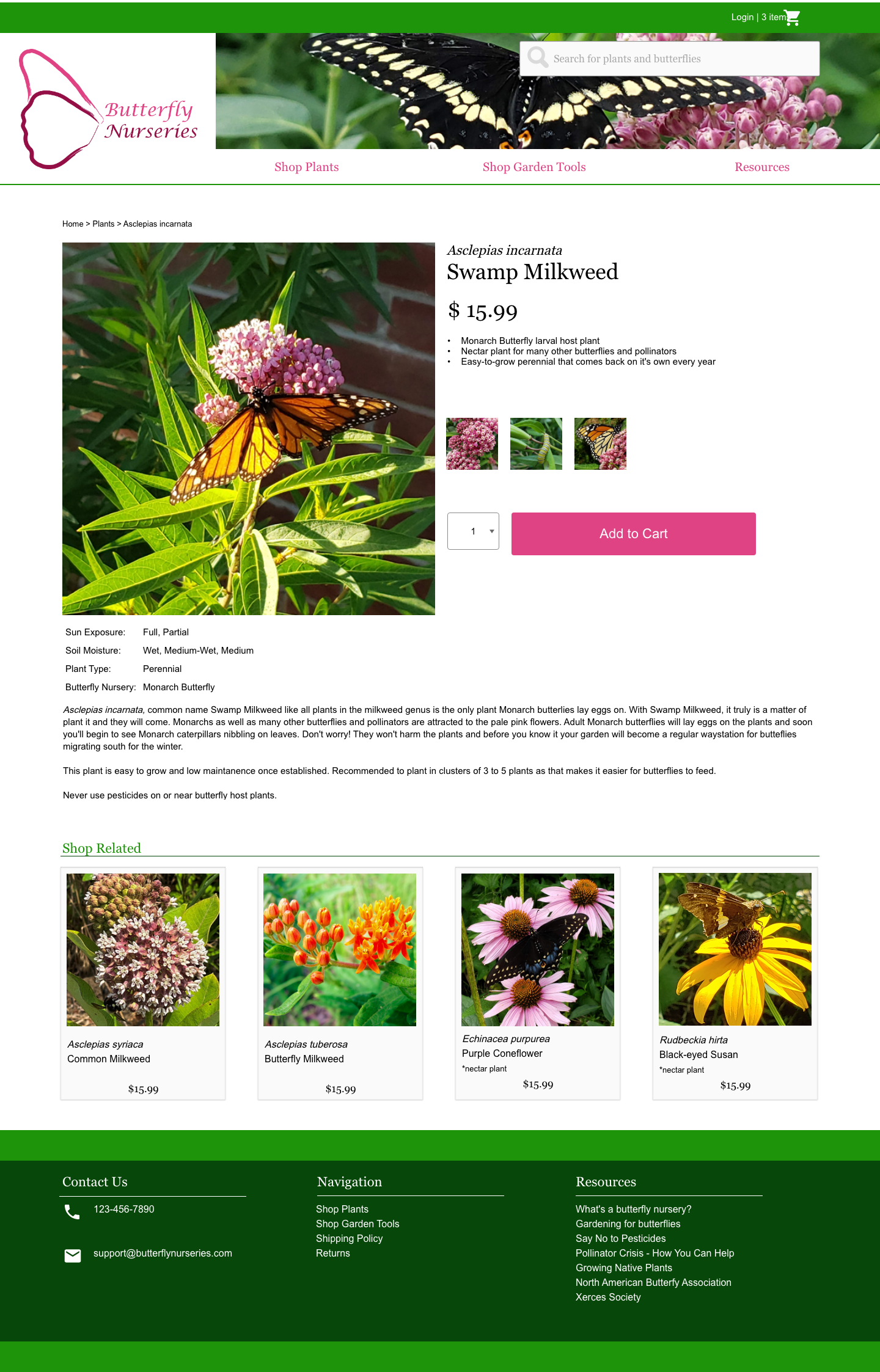
Butterfly Nurseries
Butterfly Nurseries is a native plant nursery that specializes in larval host plants of New Jersey butterflies. Our business supplies high quality, easy to grow, native plants.
Style Guide
Logo
The logo for Butterfly Nurseries is a silhouette of butterfly wings done in brushstrokes in bright and dark pinks with the text “Butterfly Nurseries” in Lucida Calligraphy Italic, also in bright and dark pinks to coordinate with the wings.
The logo should always be displayed on a white background or white rectangle with white spacing 10% the size of the logo on all sides.

Color Strategy
By centering the colors of one of the most famous larval host plants (or as we like to call them butterfly nursery plants), we visually center the idea and inspiration behind our business.
The naturalistic color scheme also evokes broadly plants, nature, flowers, leaves, all central associations with our business. The bright pop of pink is also cheerful and fun.
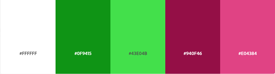
The primary colors of our brand and website are dark and bright pink based on the main colors of Asclepias incarnata, swamp milkweed. They will be used for call-to-action items, links, and buttons.
The secondary colors for our website are green and white. A white background will create a clean, easy to read design and will not draw the user’s attention away from our image rich site design.
Green’s associations with nature, environmental protection, growth and hope are central to our business values of habitat restoration and supporting declining pollinator populations. Green is of course the color most naturally and strongly associated with plants so as a native plant nursery, this color is central to our brand identity.
UX Evaluation & Wireframes

Goals of UX Evaluation:
Key goals of this evaluation are
to determine if the purpose of the Butterfly Nurseries website prototype is clear to users
to test the usability and flow checkout to ensure a seamless purchasing experience for users
to evaluate if the website is easy for users to navigate
UX Evaluation Process
The evaluation methods included a think aloud interview and observation as well as a questionnaire.
Think Aloud Interview & Observation
Users were asked to complete a think aloud interview to help understand what users were thinking during the observation. Users were shown the Butterfly Nurseries Homepage and then, being advised to say what’s going through their heads out loud prompted with questions such as
What do you think this site is for?
Whose site do you think it is?
What kinds of things do you think you can do here?
What sort of products do you think are sold on this website?
Users were then asked to go through the following tasks while continuing with the think aloud technique. This technique allows us to evaluate user expectations of site behavior for parts of the prototype that are not fully functional, such as search or filters.
Task 1: Let’s say you’re thinking about getting a tree for your garden, where would you go on the site? Remember to keep saying what’s going through your mind out loud.
Task 2: You’ve changed your mind about the tree are going to checkout with the items you’d added earlier. Where would you click next?
Task 3: Go ahead and check out with your cart. You’ve decided to go with regular shipping.
Questionnaire
After completing the think aloud interview & observation, users were asked to fill out the following questionnaire to further understand their experience of the website as well as understanding the background and interests of the user.
The questionnaire collects basic demographic information such as name, age, gender, and more specific information such as
Do you currently have a garden?
If so, do you currently grow native plants in your garden?
Did this website increase your interest in buying plants you hadn’t considered before?
The questionnaire also includes questions with a Likert Scale to determine the users opinions and satisfaction with navigating the website, answering questions such as
How easy is it to find the cart?
Are users confused about checkout process?
Would you shop from this site?

Evaluation Findings
Qualitative data often provides a richer and more in-depth way to understand user behavior. In this regard, the think aloud interview and observation were invaluable.
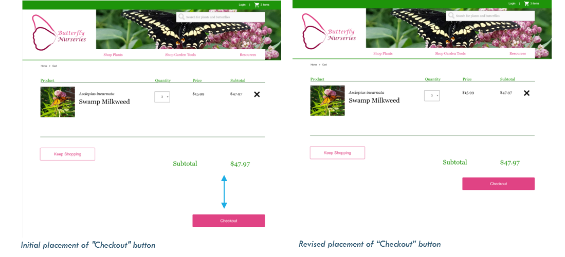
By observing the user interact with the website, I was able to see her scanning each page on the checkout screen for a button to move further in the process. The website design however initially had the buttons spaced well below the text and required scrolling. Watching the user scan, scroll a little, scan some more, it was clear that the button to move on to the next stage of checkout was not where she expected it to be.
One of the challenges with quantitative data is the information is limited to only what the question asks as there is no space for follow up unless the user themselves shares further information. For example, as per the questionnaire results most users agreed or strongly agreed with questions that aimed to evaluate if the website is easy for users to navigate. There is no way to determine with the users who only “Agreed” had confusion or difficulty navigating the website.
Similarly, the question designed to test the usability and flow checkout to ensure a seamless purchasing experience for users held slightly mixed results.

Qualitative data often provides a richer and more in-depth way to understand user behavior. In this regard, the think aloud interview and observation were invaluable.
By observing the user interact with the website, I was able to see her scanning each page on the checkout screen for a button to move further in the process. The website design however initially had the buttons spaced well below the text and required scrolling. Watching the user scan, scroll a little, scan some more, it was clear that the button to move on to the next stage of checkout was not where she expected it to be.
One of the challenges with quantitative data is the information is limited to only what the question asks as there is no space for follow up unless the user themselves shares further information. For example, as per the questionnaire results most users agreed or strongly agreed with questions that aimed to evaluate if the website is easy for users to navigate. There is no way to determine with the users who only “Agreed” had confusion or difficulty navigating the website.
Similarly, the question designed to test the usability and flow checkout to ensure a seamless purchasing experience for users held slightly mixed results
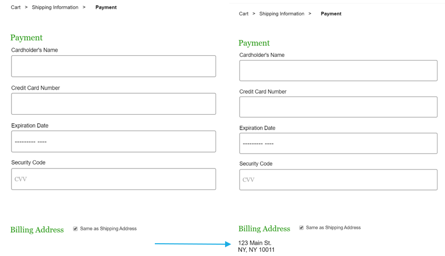
But in this case, one of users left the following comment in the open-ended input questions “Is there anything else you want to share?” at the end of the survey:
“When I selected the 'use same as shipping address' it did not show my shipping address and I could not confirm it which is something I'm used to on other e- commerce sites”
The questionnaire results were most helpful in determining users’ attitude to the website as a whole. All users who filled out the questionnaire were gardeners, most already grew native plants but only 50% had purchased plants online in the past.
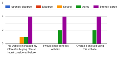
These results indicate that the site design has the potential to convert new customers, both those who have never purchased plants online before and by introducing users who were mostly already growing native plants to consider the same plants in a new and enticing light.
Design Changes based on Evaluation
Making Buttons Easier to Locate during Checkout.
Based on the findings of the think aloud user interview and observation, it was clear that the user spent significant time scrolling and scanning for call to action buttons during checkout. This led to a redesign where buttons were placed much closer to final text.
All checkout process buttons were similarly revised to be closer to the text. This relatively minor revision should reduce the amount of time it takes the user to complete checkout by reducing scrolling and scanning for buttons required to move to the next step of a multi-page checkout.
Allowing user to confirm data entered
Feedback from questionnaire where a user submitted an expectation of being able to confirm Shipping Address entered on an earlier screen resulted in changing the prototype design on the “Payment” page accordingly: