An emphasis on User Interface
Homeward Bound
A navigation, layout, and input form redesign for a pet adoption website.
Navigation Patterns
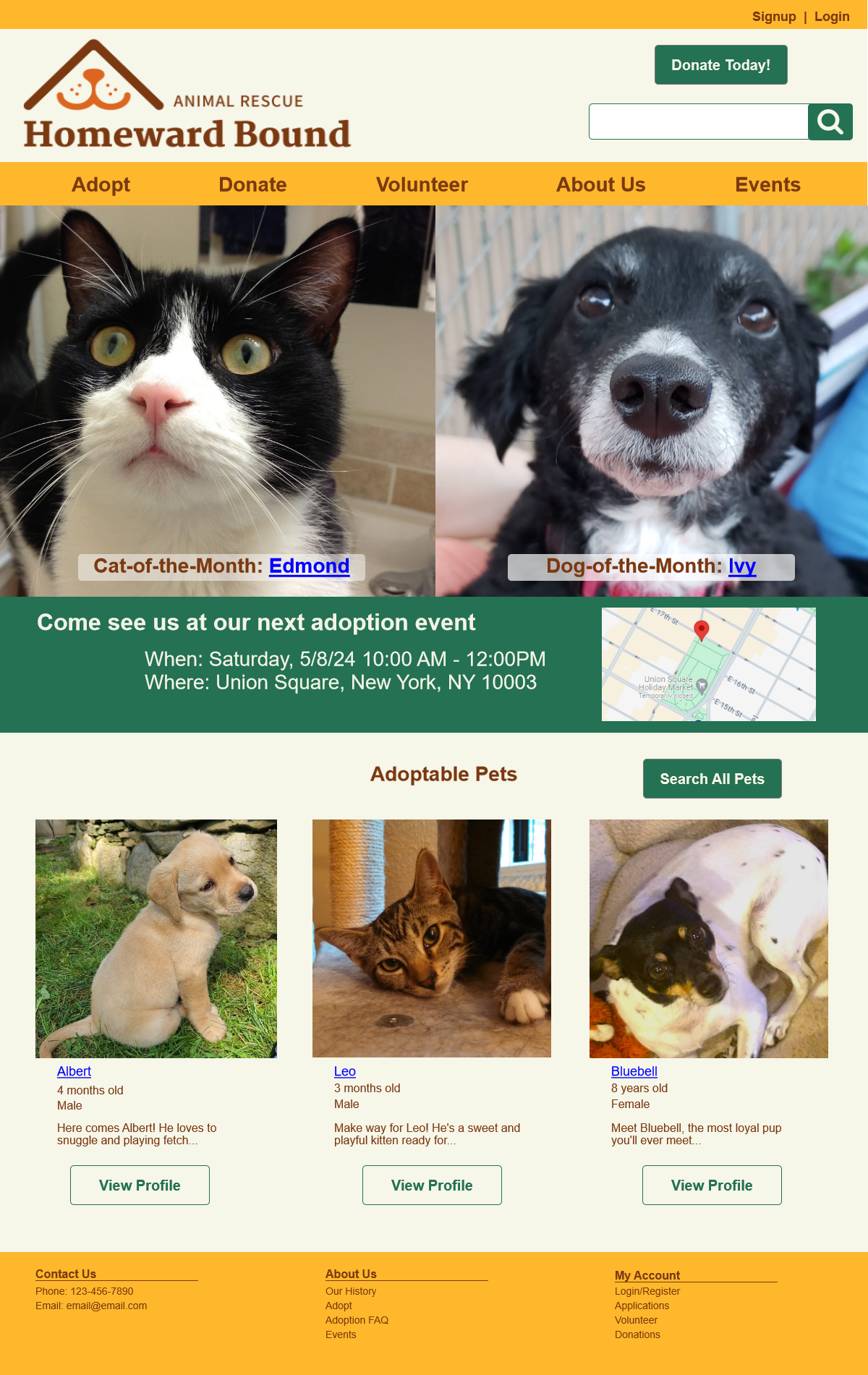
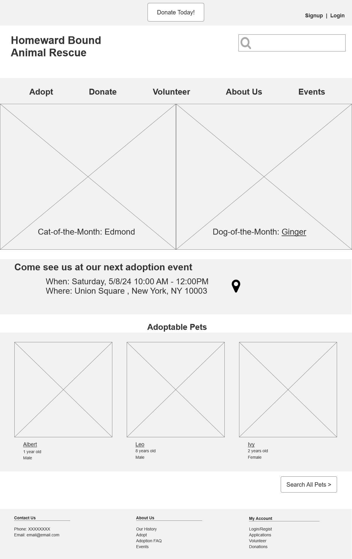
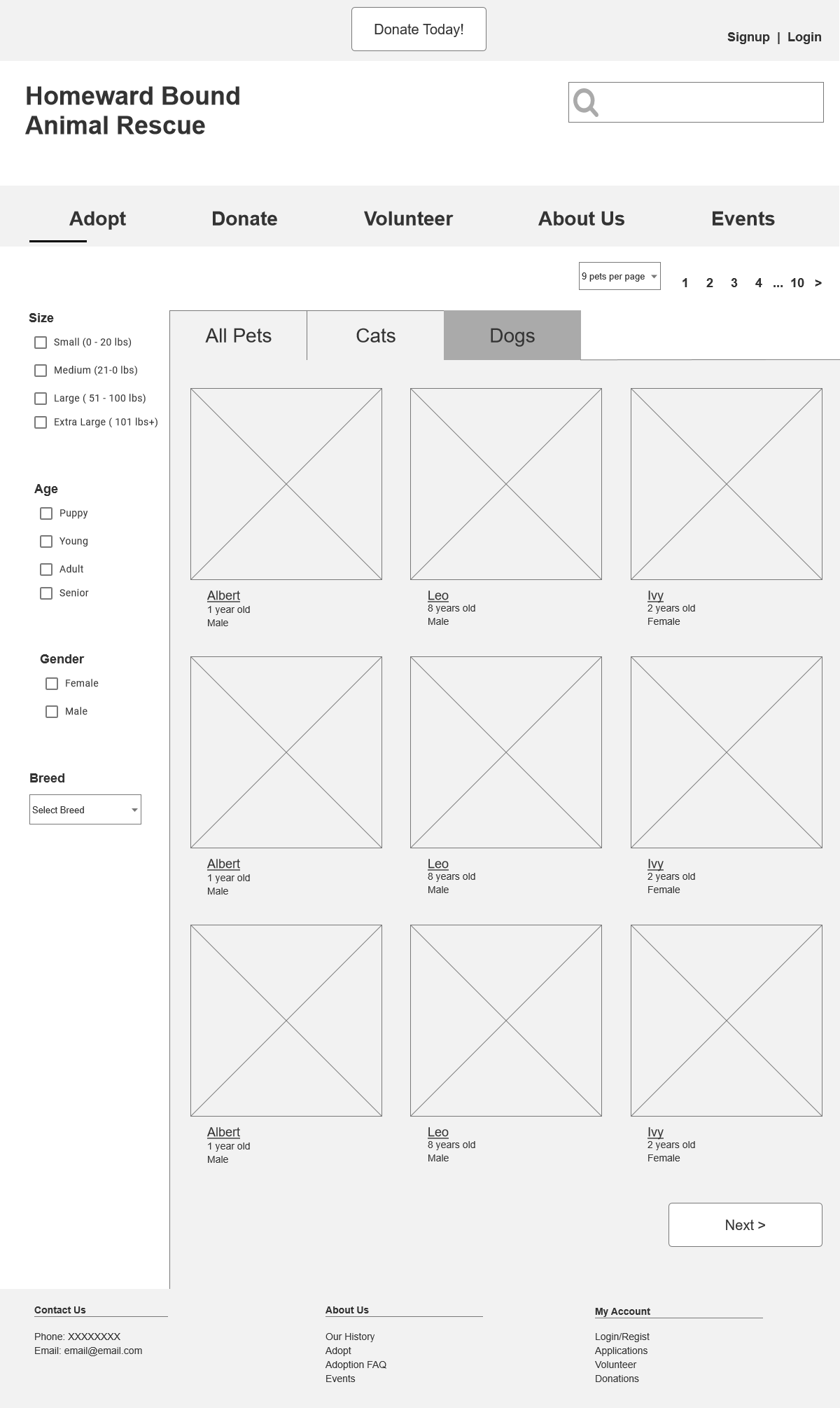
On all pages, I have global navigation (in the header and the footer) and utility navigation in the upper right corner because it’s important for users to be able to easily find what they’re looking for. I’m also using breadcrumbs as signposts to help orient the user and allow them to easily go back one step for example from the detail page to a filtered set of search results.
Navigation Patterns
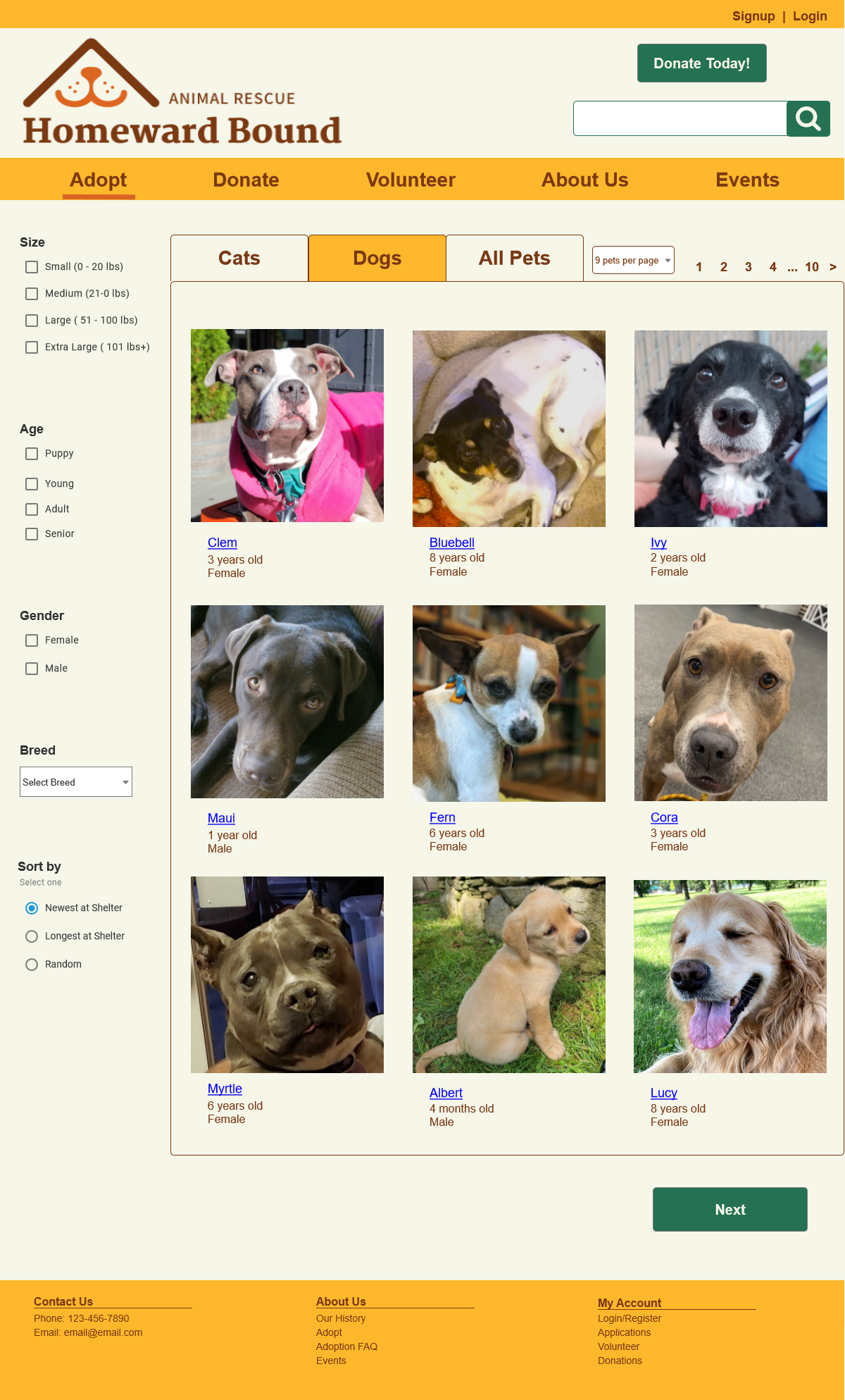
On all pages, I have global navigation (in the header and the footer) and utility navigation in the upper right corner because it’s important for users to be able to easily find what they’re looking for. I’m also using breadcrumbs as signposts to help orient the user and allow them to easily go back one step for example from the detail page to a filtered set of search results.
Form Design Patterns
The search result page is using the grid of equals as a layout. I picked this pattern because all the search results should have equal visual weight because all are equally important. This way the user can easily browse and pick the one they want to see a more detailed profile. I used hyperlink blue underline texted in the search results to indicate the pet name is clickable and imply that clicking on the name will open the pet’s profile page.
The content submission page uses titled sections that define separate sections based on content, which should make data entry easier. There are also many sections so titled sections also allow the user to browse and get a sense of what will be asked of them in the form data entry. The titled sections are collapsible panels so the user can choose which to open to reduce clutter.

